Thursday, March 24, 2011

Eye theory and colour theory.

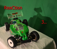
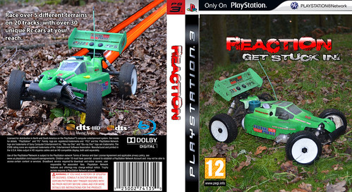
In the west the eye follows the same path on a image. They start slightly to the right of the centre, then to the top to the right bottom of the page. This makes a Z shape. I have used this idea on the adverts I have made.

Colour theory is also something I looked into.
A massive post about colour and its relationship, http://www.jiscdigitalmedia.ac.uk/stillimages/advice/colour-theory-understanding-and-modelling-colour
http://en.wikipedia.org/wiki/Color_wheel Wikipedia post on colour wheels.


Red is the color of fire and blood, so it is associated with energy, war, danger, strength, power, determination as well as passion, desire, and love.
Orange combines the energy of red and the happiness of yellow. It is associated with joy, sunshine, and the tropics. Orange represents enthusiasm, fascination, happiness, creativity, determination, attraction, success, encouragement, and stimulation.
Blue is the color of the sky and sea. It is often associated with depth and stability. It symbolizes trust, loyalty, wisdom, confidence, intelligence, faith, truth, and heaven.
Yellow is the color of sunshine. It's associated with joy, happiness, intellect, and energy.
Green is the color of nature. It symbolizes growth, harmony, freshness, and fertility. Green has strong emotional correspondence with safety. Dark green is also commonly associated with money. 
White is associated with light, goodness, innocence, purity, and virginity. It is considered to be the color of perfection.
Black is associated with power, elegance, formality, death, evil, and mystery.

The 2 adverts, ReaCtion

Advert 1


Advert 2, this carries on from advert 1

Tuesday, March 22, 2011

A2 evaluation on Prezi


This will continue to be updated till this coming friday.

Editing problems

Today I planned a mass editing marathon, where I completely finished the 2 adverts with new footage. Alas it was not ment to be, the school server was having problems and final cut couldn't find my files. Error 41.
I will have to finish it off between lessons on wednesday and thursday.

Saturday, February 26, 2011

Games adverts in magazines


This is the font cover for a Playstation magazine. This is advertising GT 4. This is also the same image as the cover of the game. This strengthens the link between the customers and the game.


The inside cover and next page showing more car and text about the game.


This is again following the conventions of this advert for the game.
What, car and simple to get the message though.


Here is a 1 page spread of a racing game. This game is also linking with the game cover and the style of the adverts.


At the bottom of this is a 2 page advert for the burnout game. Its exactly what you would expect for the game and the advert conventions.
The game is all about taking down the other drivers which is what has happened here. The fire and the crash will attract the right audience to buy the game.


2 page spread for Motorstorm 1. This use metaphors, the world is in your hand. Linking with the rock shaped like a hand.
Motorstorm also boast their landscape design and views. This ties in with the view from up the hill, showing the cars in the race.


 This final advert is for the then new PS3. The colour use and text is eye catching and has a very bold statement. It will keep in your memory till you next see the PS3 or anything related to it.

Friday, February 25, 2011

Game cover

This is the first copy of the front cover.
Made up of many different photos and Photoshop editing.